Resolution is a headcount, and a headcount says nothing about sharpness. Does screen resolution change what you see? Yes, but only through the angle each pixel takes up in your view. That angle depends on the screen’s size and on how far away you sit.
This guide follows one 27-inch monitor at 70 cm and shows what each step up in pixel count changes. It assumes a flat desk screen in a United Kingdom home, with every distance in centimetres. Along the way you’ll see why one panel looks crisp from one chair and coarse from another.
Does screen resolution change what you see, and what does that leave out?
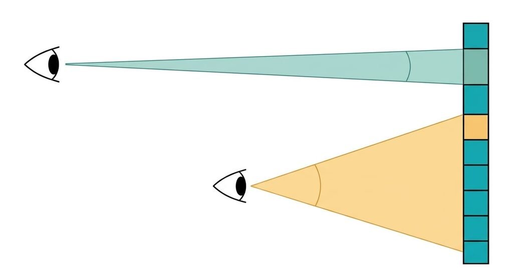
Resolution is the number of pixels across and down, a fixed grid of tiny lit squares. Resolution only counts pixels, and what reaches you is how many of them fall inside each degree of your view. Two screens with the same count look different when one is larger or farther away, because each pixel then covers a different angle.
That compact answer hides three things. The count says nothing about physical size. A 24-inch screen and a 32-inch screen with the same grid have very different pixel sizes. It says nothing about how large the interface looks either, because the operating system decides that separately. And the grid belongs to the panel. It has one native count, and anything sent at another count must be resampled before it’s shown, which means every pixel is recalculated. Much of the disappointment with new screens starts at that step. A buyer who moves from a small screen to a large one at the same count has changed the pixel size without noticing. The picture then looks coarser from the same chair.
How resolution changes what you see, step by step
Take a 27-inch 16:9 screen. It measures about 59.8 by 33.6 cm, and you sit 70 cm from it.
The grid comes first. With 2560 pixels across, each one is 0.23 mm wide. From 70 cm, a 0.23 mm square covers about 1.15 arcminutes of your view, where an arcminute is a sixtieth of a degree. Turned around, that is 52 pixels in every degree.
A standard letter chart treats one arcminute, or 60 pixels per degree, as the smallest detail a typical viewer can separate. At 52 you sit just short of it, so the stair-step on a diagonal line or a thin curve is faintly there.
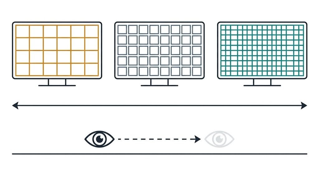
Now change only the count. With 1920 across the same width, each pixel grows to 0.31 mm and you get 39 pixels per degree. Small text shows its grid. With 3840 across, each pixel shrinks to 0.16 mm and you get 78 per degree, which clears the chart mark. Then change only the distance: slide the 2560 screen back to 100 cm and the same pixels give 75 per degree. Sitting farther away bought almost what a new panel would have.
Two steps sit between the grid and the glass. The operating system applies a scale factor first. That setting decides how many physical pixels draw each interface element, and only then are the letters shaped. At 200 percent, a 3840-wide screen lays out like a 1920-wide one, so text keeps its size and gains edge detail. At 150 percent it lays out like a 2560-wide one. Some systems draw the page larger at fractional factors and shrink it to fit, which can cost a trace of softness.
The eye’s limit moves with the content. Black text on white is the harshest test, so text shows the grid before a photograph does.
The mosaic, and where it breaks
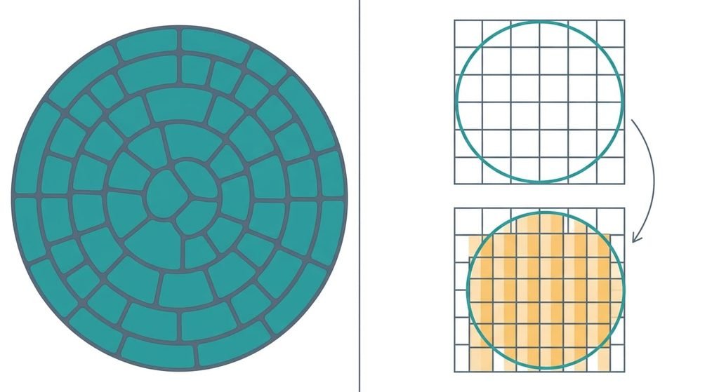
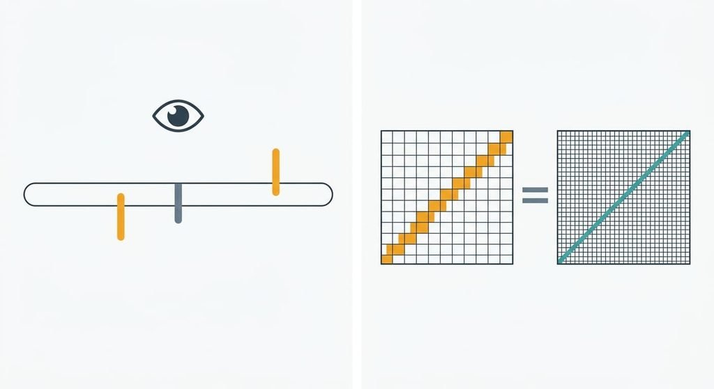
A mosaic floor makes the idea easy. From the doorway you see a picture, since your eye can’t separate stones that small. Step close and the stones appear. Pixels behave alike. Sit back and they blend.
The comparison fails at who chooses the stones. A mosaic maker places each piece to follow the picture. A screen’s grid exists first, so every image must be fitted onto it. When the image matches the panel’s own grid, its native resolution, each source pixel lands on one screen pixel. Otherwise source pixels straddle screen pixels. A 2560-wide image on a 3840-wide panel does this, since each source pixel must cover one and a half screen pixels, so the edges blur. Mosaics never have that problem, and a screen has it whenever the two grids differ.
What a higher resolution can’t do for you
A bigger count adds room for detail, though a screen can only show the detail the picture already holds. A photo that is 1280 pixels wide gains nothing from a 3840-wide panel except being stretched to three times its width. Each original pixel then fills a 3 by 3 block, so the picture is no sharper than it was, only larger. Can screen resolution change what you see in a file that holds little detail? Only in how that file is stretched.
Colour accuracy and contrast sit outside the count altogether. So do brightness and the speed at which pixels change. A higher count doesn’t give you more working room either. Unless the scale factor stays at 100 percent, the extra pixels draw finer letters instead of fitting more windows.
A screen across the room stays coarse for fine print whatever its count, because the angle per pixel is what limits you.
What people get wrong about resolution
The first belief is that 60 pixels per degree is the point where more pixels stop showing. It formed because the letter-chart standard became shorthand for the limit of human sight. Yet that pass mark was set for reading letters on a chart, and the eye does better on fine contrast. Published lab measurements of fine black-and-white patterns, viewed straight on, put the average nearer 94, and patterns defined by colour alone fall lower. Treat 60 as a useful band edge for desk text.
The second belief is that a higher resolution makes everything smaller. That was true when screens had one pixel size and interfaces drew themselves in raw pixels, so more of them meant smaller icons. Scale factors broke that link years ago, and a 3840-wide screen at 200 percent shows the same-sized letters as a 1920-wide one.
I’d call the pixel count the weakest figure on a spec sheet, because it has no unit of sight attached.
Work out your own pixels per degree
Multiply the pixels across by your distance in centimetres, then divide by 57.3 times the screen’s width in centimetres. The result is the pixels per degree. A 24-inch 1080 screen, 53 cm wide, gives 44 at 70 cm and 63 at 100 cm. A 32-inch 3840-wide screen, 71 cm wide, gives 66 at 70 cm.
Below about 45, expect small text to show its grid. Between 45 and 60 is a grey band, since text on white shows the grid sooner than photographs. Above 60, the screen seldom limits ordinary desk work. Does screen resolution change what you see at that point? Barely, and your money works harder on size or distance.
Resolution counts pixels. Size and distance set how many fall inside each degree of your view, and that number is what reaches your eye. The limit worth keeping in mind is that a screen can’t show detail the picture never held. A chair 20 cm farther back lifts the 27-inch example from 52 to 67, so work out your own number before you pay for more pixels. The sum takes two measurements and a minute.
Questions readers keep asking
Can a higher screen resolution make text too small to read?
Yes, when the scale factor stays at 100 percent, because the interface is then drawn in raw pixels and more pixels mean smaller letters. Raising the scale factor restores the size and puts the extra pixels into finer edges. Fractional factors can look slightly softer on some systems.
Do I need 4K for a desk monitor?
Not always. Will screen resolution change what you see enough to justify the extra cost? Work out the pixels per degree first. A 27-inch screen at 70 cm gives 52 with 2560 pixels across and 78 with 3840. If you sit farther back or mostly watch video, the gap shrinks. Text up close is where the extra pixels show.
Is screen resolution the same as pixel density?
No. Pixel density is the resolution divided by the screen’s physical size, usually in pixels per inch, so it ignores where you sit. Pixels per degree adds your viewing distance, which is why two people looking at one screen from different places see different sharpness.