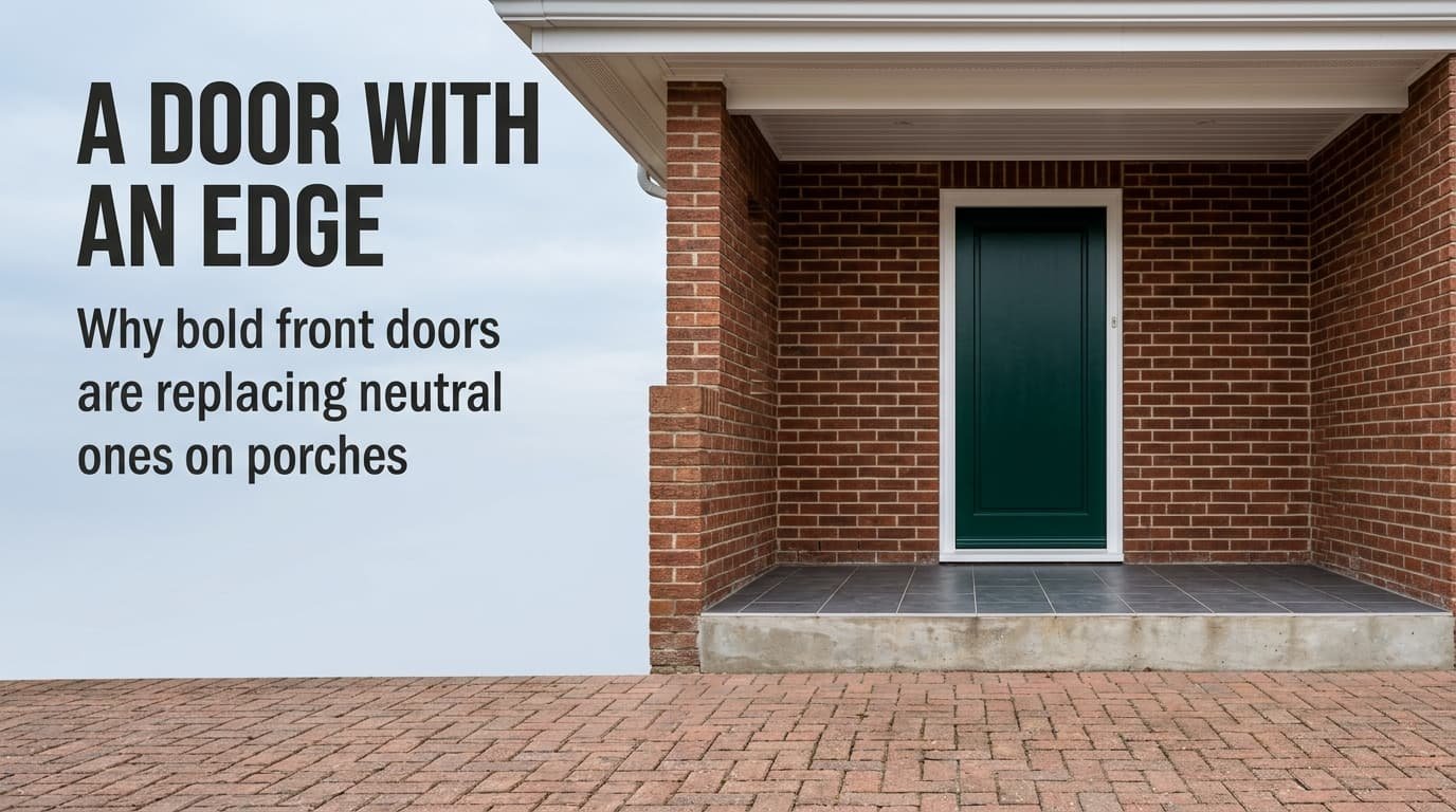
Many porches look flat because everything made of wood is painted one pale tone. Whether bold front doors are replacing neutral ones across a street is a market question I can’t check, and the measurable change is real. Take a bold door where the brick is quiet and the frame is white and sound, and keep a neutral one anywhere else.
The sums use a covered porch in a Dutch terrace. It is 240 cm wide and 150 cm deep under a 250 cm roof. Light-reflectance figures are round and assumed, so read them as shapes. Your own paint chart gives the real ones.
Where bold front doors replacing neutral ones came from
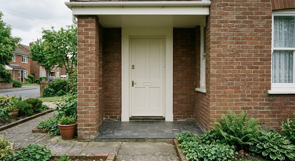
Across most of the twentieth century, terrace doors were painted to match everything else made of wood. One tin covered the door and the frame. The same tin did the casements and the soffit. The safest choice was one colour for all of them. Pale tones also suited the factory-made frames that spread through the 2000s, because white was the default colour of those products. The door matched its frame without anyone deciding.
Two conditions loosened that habit. Factory-applied finishes and coloured composite doors often meant a deep colour no longer implied a repaint every few years. So the cost of a strong colour fell. The porch also became a place people use. It gained a bench and a mat, so the door at its end turned into the thing the porch is arranged around. Neither shift can be dated here, and any source that dates them exactly deserves a check.
A match is also a decision about upkeep. A door the same colour as its frame needs no neat cutting-in along the edge, because a slip disappears into the same paint. That forgiveness is one reason the habit lasted.
What changed as bold front doors are replacing neutral ones
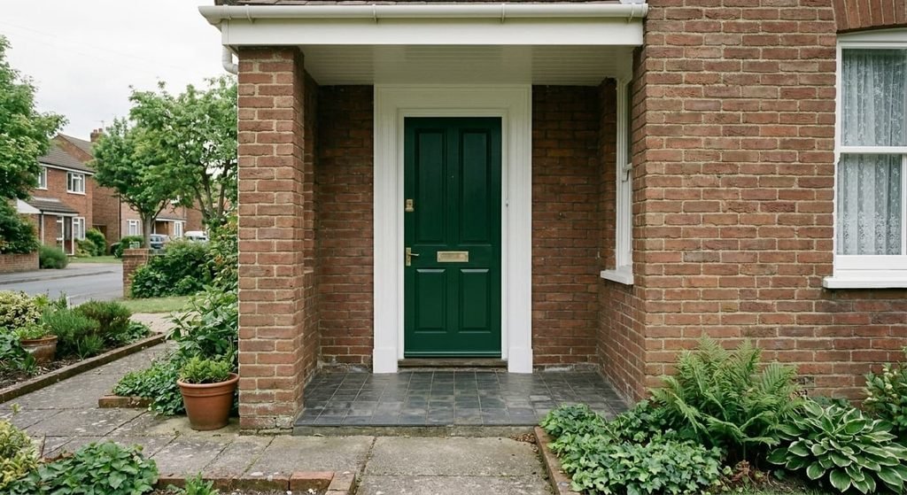
Start with the wall. The back wall of the porch is 240 by 250 cm, which is 6.0 m². The door leaf, at 93 by 211 cm, is 1.96 m², or 33% of it. One colour therefore controls a third of what a visitor faces at the end of the porch.
The scale for the next figures is light reflectance value (LRV). On it 0 is black and 100 is white. Take a pale door at 85 and a white frame at 90. The soffit matches the frame, and the brick sits at 25. The old door sat 5 points from its frame, so the edge of the entrance vanished into one pale block. A deep green or blue door at 10 sits 80 below that frame. In numbers, the change runs from a 5-point to an 80-point gap in reflectance between door and frame.
That gap lies along an edge 515 cm long, made of two sides of 211 cm and a head of 93 cm. It is the line a visitor’s eye follows to read the entrance as a shape.
Two other counts shift with it. The view held two colour families before: brick and white. It now holds three, because the door becomes its own. The bold door sits only 15 points from the brick, so the frame draws the edge and the wall does not.
A chip also reads differently in a porch, because under a 250 cm roof the door receives less light than the chip did in the shop.
Who it suits, and who it doesn’t
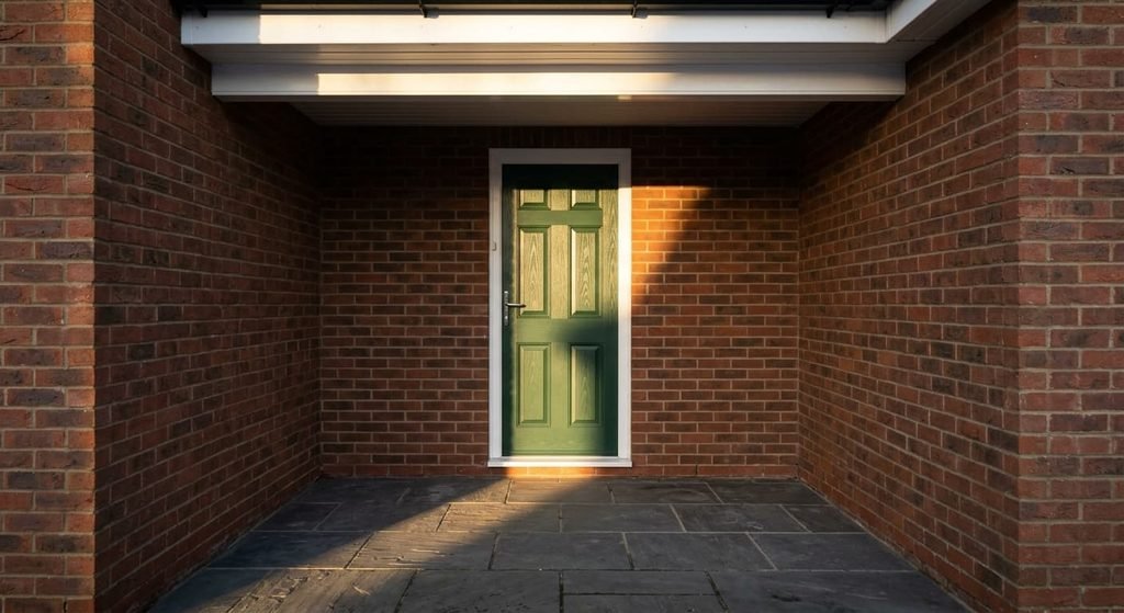
It suits a porch with quiet brick and a sound white frame. Those two give a deep door a clean edge on every side. It suits a north-facing porch too, with one change of method. Sunlight never reaches that door itself. Pick a mid-tone, around LRV 20 to 30, because a colour at 10 reads near black in skylight alone.
It also suits a south-facing porch, for a reason that surprises people: the roof does the work. At Dutch latitude the noon sun stands about 61° high in midsummer. The front edge of a 250 cm roof then throws shade 139 cm back, and the 150 cm porch keeps the door out of direct summer sun. In midwinter it drops to about 15° and lights the door up to 210 of its 211 cm, when heat does little harm. Low sun entering from the open side is a case I can’t see from here.
It doesn’t suit a warm red door on red-brown brick. The two share a colour family and sit 15 points apart, so the door sinks into the wall. It doesn’t suit a frame gone cream either, since an 80-point edge shows every yellowed corner. A household that touches the door all day will also see fingermarks and dust on dark satin sooner than on pale paint.
Is a bold front door worth adopting?
Adopt it where the door is the only dark surface in the view and the frame is white and sound. Whether bold front doors are replacing neutral ones on your street is beside the point, since the wall in front of you decides it. I’d argue this is a frame decision more than a colour decision, because the 80-point edge is what a visitor reads first.
The cost is low and the change is lopsided. Going from pale to deep takes two coats. Going back takes a stain-blocking primer first and then two more coats, since a pale colour hides a dark one poorly.
Treat the first step as easy and the return as a job.
What would make it date is a finish that belongs to one period, or a colour spread over surfaces you would have to repaint together. If the frame needs repair, repair it before the door goes dark.
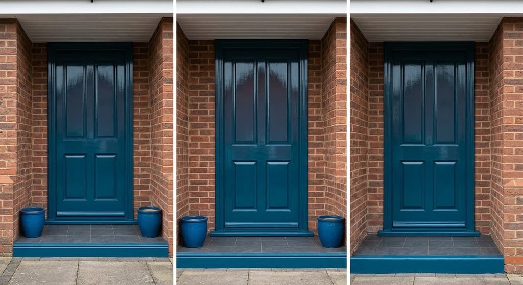
The version that will date fastest
In any shift where bold front doors are replacing neutral ones, the matched set in full gloss is the extreme version. The leaf and the frame take one saturated colour. The step edge and the pots follow, all in a high-shine finish. It dates for two reasons. Gloss reflects light like a mirror, so every ridge at a panel joint and every patch of filler shows across 1.96 m². A slight bow in the leaf turns the reflection of the opposite wall into a wavy streak. And the colour is fixed in four places, so changing it means repainting four things instead of one.
It also removes the edge that made the bold door legible. Painting the frame to match drops the gap between door and frame to zero. Leaf and frame merge into one dark mass.
A moderate version is one deep colour in satin on the leaf. A white frame stays and everything else stays plain. Satin hides a slightly uneven surface and leaves a single thing to repaint.
How to try a bold door without committing
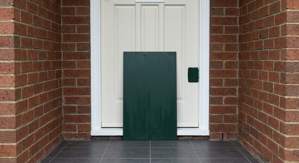
Paint a board of 60 by 100 cm, about 0.6 m² or 31% of the leaf, in two coats of the colour you’re considering. Then lean it against the door for a week. Look at it at the hour you come home and again at midday, because the roof changes what a chip showed. If it reads almost black, go one step lighter. Photograph it at both hours with the phone held at the same height.
For a second test, paint a patch of 20 by 20 cm low on the leaf, where a later coat would hide it. That shows how the real surface takes the colour.
Bold front doors are replacing neutral ones where the numbers favour them. Those are a quiet wall and a sound white frame, with a leaf that holds a third of the view. Elsewhere the pale door still does the job. That verdict is about this wall, and your wall may differ. Test one board first, since the porch’s own shade decides the colour and the shop never will.
Questions readers keep asking
Is it a mistake to repaint a neutral front door in a bold colour?
No, if the frame is white and sound and the brick is quiet, because the 80-point edge then does the work. Check the frame first, since a cream one shows. The return costs more than the trip out: deep to pale takes a primer and two coats. Try a painted board before you touch the door.
Does a bold front door suit a north-facing porch?
Yes, with a lighter tone than you’d choose in the shop. No direct sun reaches a north-facing door, so a colour at the dark end of the scale reads near black in skylight. Pick a mid-tone and look at a painted board at midday before you commit to the whole leaf.
How long does a bold front door colour last before it needs repainting?
The colour matters less than the surface under it. Preparation and exposure set the interval, and a covered porch shields the door from rain and from direct summer sun. Dark satin shows dust and fingermarks sooner, so it can look tired before it fails. Wash it before you decide it needs paint.