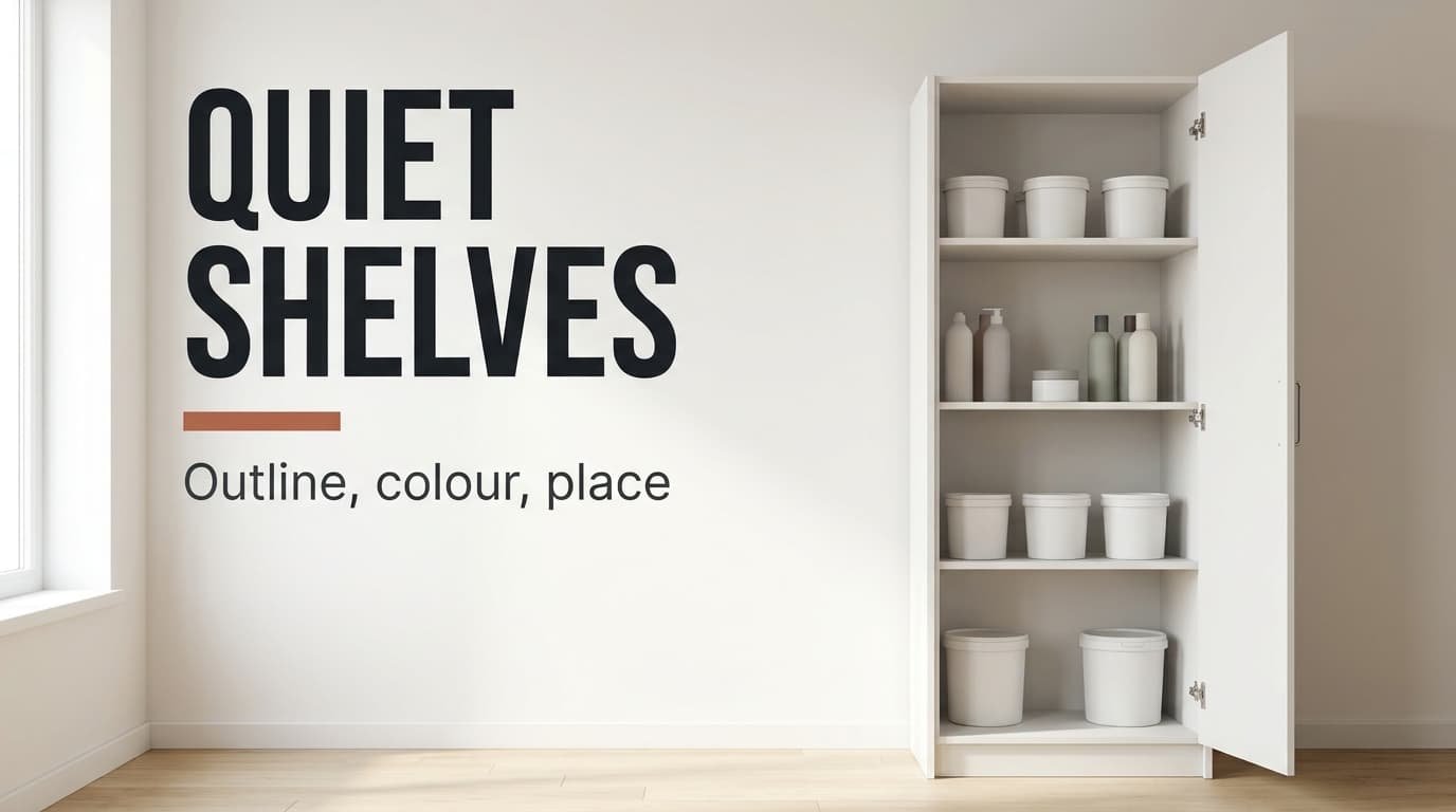
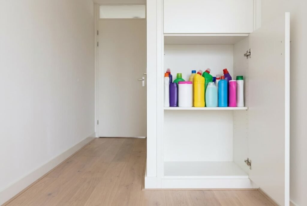
A shelf of twelve bottles and tubs can read as a crowd, while twelve books of the same total width read as calm. The contrast shows why a utility cupboard looks chaotic even when every item carries a tidy label. Eyes take in outline and colour, then position, long before they reach a word. The cupboard in our model is Dutch and stands in a hallway. It’s 80 cm wide and viewed from the opposite wall at 100 cm. Nothing here needs special skill. Three checks name the fault, and three fixes follow, running from costless to bought. These figures come from a simple model. Take your own readings.
Why a Utility Cupboard Looks Chaotic: What the Eye Reads First
People blame the clutter or the missing labels, yet the eye reads the outline long before any label. At 100 cm, lettering 8 mm tall is among the last details to register. Three other signals arrive earlier, and together they are the reason a utility cupboard looks chaotic after a thorough relabel.
The first signal is the skyline. Our eye-level shelf holds twelve items in six heights, from 12 cm up to 33 cm, with two items at each height and no order to them. Add up every rise and fall along the row and the top edge travels 133 cm up and down. That jagged line reads as disorder at once.
The second signal is colour. Our twelve items come in eight hues, and every change of colour is one more edge for the eye to cross.
The third is position. At 100 cm the middle 20° of what you see covers a patch about 35 cm across. For someone with eyes at 150 cm that means the band from 132 to 168 cm. Whatever stands in that band is read first. A loud bottle there outranks everything around it.
Three separate signals call for three separate cures.
Which Fault Is Yours? Three Checks Before You Change Anything
Stand in the doorway where you normally stand, with the cupboard open. Switch the hallway light on. Allow two minutes per check. Take a phone and a pencil with you. Don’t tidy anything beforehand, because you want to see the cupboard as it normally looks.
For the first check, squint until the detail blurs and name the single item that still stands out. A bottle inside the central band points to placement. Ours is a bright orange spray at 150 cm, and it was obvious within a second.
For the second check, photograph the shelf, then turn the photo greyscale. A top edge that still looks ragged means scale, and 11 steps along 12 items is far too many. A shelf that looks calmer in grey than in colour has a colour fault as well.
For the third check, count the hues with the pencil. More than four is a lot, and ours has eight. Our cupboard shows all three faults, with the skyline the strongest of them.
Three Faults That Make a Utility Cupboard Chaotic
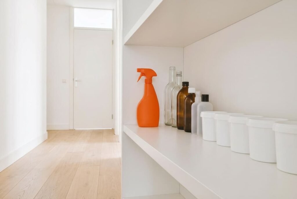
“My eye lands on one bottle” is a placement fault. The orange spray stands at 150 cm, dead centre of the 35 cm band. It gets read ahead of everything else, which drops into the background. Swapping it with a plain white tub from the bottom shelf, at 30 cm, solves it for nothing. Moving the pair takes a single minute, and a second squint from the doorway should show your eye landing on the tub and moving on. Convenience is the cost: a bottle used daily now sits 120 cm lower, which means a deep bend each time. Neither taste nor budget plays any part here, only where each object stands.
“The row looks like a skyline” is a scale fault. Sort the twelve items from tall to short, working left to right. The outline stops jumping: 33, 33, 28, 28, 24, 24, 19, 19, 15, 15, 12, 12. The travel falls from 133 cm to 21 cm, a cut of 84%, and the steps fall from 11 to 5. Rearranging takes ten minutes, with no outlay at all. Begin with the two 33 cm bottles on the far left, then work down. The row is done when no neighbour differs by more than 5 cm. Clearance sets the limit. The tallest bottles need 35 cm of free height above them, which means a shelf spaced at only 30 cm sends them to the lowest level, where the row can’t be sorted into one line.
“The colours fight each other” is a colour fault. Six dry goods in boxes, each box a different colour, plus six bottles in two colours, give the eight hues. Pour the six dry goods into six matching white tubs and only three hues remain: white and the two bottle colours. Pick tubs of one height, such as 15 cm. A mixed set would add a fresh skyline of its own. This is where a purchase enters, and the tubs cost little beside new shelving. Decanting does lose the printed instructions from the boxes. Cut the instruction panel out and tape it inside the lid. The information then travels with the contents.
What to Check Before Anything New Goes On a Shelf
Put every newcomer through three questions at the shelf, before it goes in. Does its height fit a step within 5 cm of its neighbours? Does it add a fourth hue? Will it stand in the 35 cm band at eye level?
Say you bring home a violet bottle 31 cm tall. It slots neatly between the 33 and 28 cm pair, which passes the scale test. Colour is the snag, because violet would be a fourth hue, and it doesn’t belong at eye level either. Keep it on the lowest shelf, or decant the contents into a white tub if the label allows it. An item that fails two questions rarely earns a place at eye level.
Whenever a utility cupboard looks chaotic again, one quiet rule restores calm: the louder the item, the lower its shelf.

The Fix That Isn’t Worth Doing
Adding more and bigger labels is what most households try next, and it feeds the problem. Each label is a dark panel on a coloured surface. Twelve labels therefore hand the eye twelve fresh edges to cross. At 100 cm the lettering is still too small to read, which means the labels give the cupboard nothing it lacked. Colour-coded labels add hues on top of the eight already present. A full relabel can’t explain why a utility cupboard looks chaotic. The outline and the colours stay just as they were.
A label maker for every item looks tidy in the shop and busy on the shelf. It’s an evening’s work that leaves the skyline untouched. When a label matters for safe use, stick it to the back of the cupboard door, where you read it up close.
Tonight, squint at the shelf from the doorway and write down what stands out. Swap the loudest item to the bottom shelf, then sort the row from tall to short. Together that costs under half an hour. Buy tubs only if the greyscale photo looks calmer than the colour one. Repeat the doorway squint every month, and again after each shopping trip, because a cupboard drifts back towards chaos one bottle at a time. Pencil the date on the door frame so the check becomes routine. Keep today’s greyscale photo for comparison, since next to next month’s it shows whether the outline has crept back.
Questions Readers Keep Asking
What makes a cupboard look messy when it is already tidy?
Three signals reach the eye before any label. A jagged outline and a crowd of colours come with one loud item in the central band. Tidy means every item has a place. Calm means outline and colours agree with the focal point. A cupboard can be the first without the second.
What is the quickest fix?
Swap the loudest bottle out of the central band at 132 to 168 cm and put a plain tub there. That needs a minute and nothing bought. The sorted row comes next, and it does more for the outline than any amount of wiping.
Can I fix it without redoing the cupboard?
Yes. Two fixes cost nothing and use only the shelves you already have. Only the colour fault needs a purchase, and that’s a set of matching tubs rather than new shelving. No renovation is involved at any point. Nothing gets drilled into the wall.