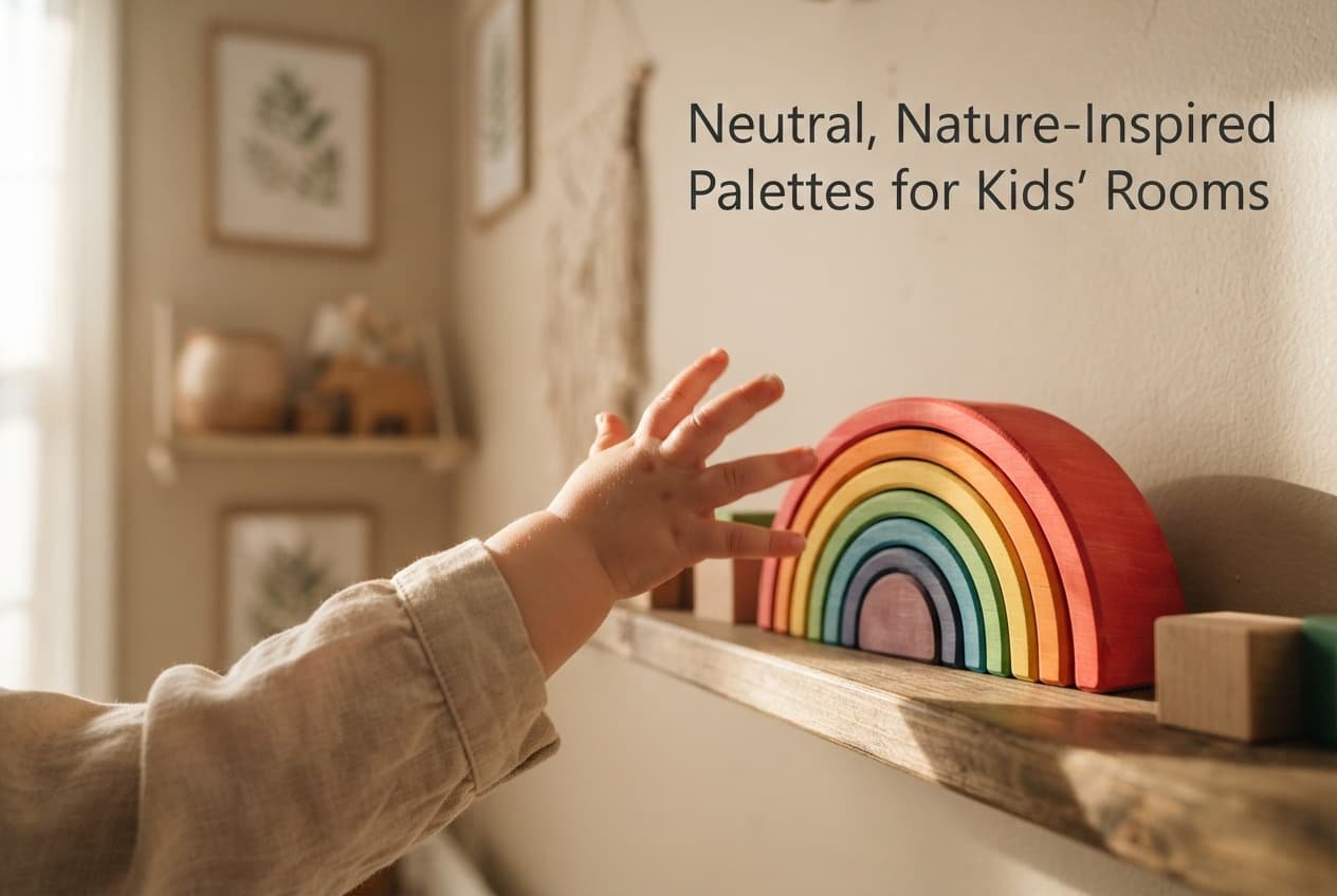
Neutral, nature-inspired colour palettes keep displacing the traditional bright primary-colour approach to kids’ room design for a reason grounded in measurable adaptability and sensory research, not seasonal taste alone. Understanding that reason tells you whether it’s worth adopting or just the current version of a cycle that will pass. The shift is real and checkable in how much genuine visual adaptability a neutral palette provides across a child’s changing developmental stages, not simply a matter of one colour scheme being more fashionable than another.
What actually changed
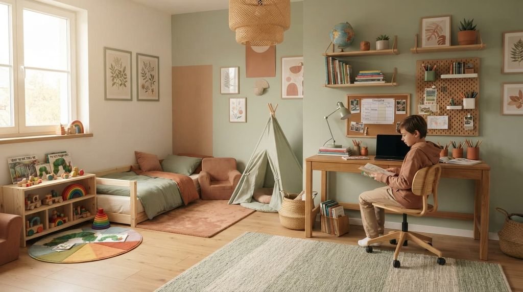
The measurable shift is a move away from bright, primary-coloured rooms designed around a very young child’s specific current stage, toward softer, nature-inspired tones – muted greens, warm terracottas, soft sandy neutrals – that don’t visually signal one narrow age range as clearly. Where a bright primary palette often reads as distinctly “toddler” or “nursery,” a nature-inspired neutral palette adapts visually across a wider span of a child’s actual growing years.
This isn’t purely aesthetic preference – it’s connected to the same adaptable-foundation principle that applies to furniture and storage choices, extended specifically to colour, which is why the approach recurs across different design eras rather than being tied to one particular decorating trend alone.
Why it keeps coming back specifically now
The continued reality that families increasingly plan for kids’ rooms to serve a child across many developmental years, rather than replacing the room’s entire aesthetic every few years, has created a direct tension that a neutral, adaptable palette specifically addresses: wanting a colour scheme that won’t feel visually mismatched to an eight-year-old the way a distinctly toddler-coded bright primary scheme often does.
For many households specifically planning for this longer view, this tension between wanting genuine personality now and needing the room to still feel appropriate years later has become increasingly relevant, which is a concrete structural reason this palette shift’s popularity tracks this broader adaptable-room planning approach rather than purely following showroom styling alone.
This distinguishes the current cycle from earlier uses of muted, nature-inspired palettes, which were sometimes driven primarily by a particular aesthetic movement’s popularity rather than by genuine longevity planning. The underlying mechanism is the same regardless of cause, but a technique genuinely driven by an actual adaptability need tends to persist considerably longer than one driven purely by a design movement’s popularity alone.
What this actually changes in a room
A neutral, nature-inspired base palette genuinely reads as age-appropriate across a considerably wider developmental range than a bright primary scheme does, which is the direct mechanism behind this approach’s adaptability benefit specifically. This isn’t purely subjective impression – it’s connected to how strongly certain colour schemes signal a specific narrow age range visually, in a way neutral, nature-inspired tones simply don’t as distinctly.
Sensory considerations also genuinely factor in specifically for some children, since existing research on visual stimulation suggests some children, particularly those genuinely sensitive to sensory input, may find a calmer, more muted colour environment genuinely more comfortable overall than a visually intense, saturated primary-colour scheme, though this specific effect varies quite meaningfully between individual children.
What this looks like in practice
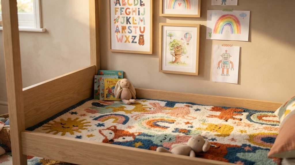
A muted sage or clay-toned wall paired with a natural wood bed frame and simple woven textiles forms a common practical expression of this approach, though the specific tones and materials genuinely vary considerably across different households’ interpretations of the broader nature-inspired direction. This underlying combination – neutral base, natural material texture – is what actually delivers the adaptability benefit, not any single specific colour swatch or material choice alone.
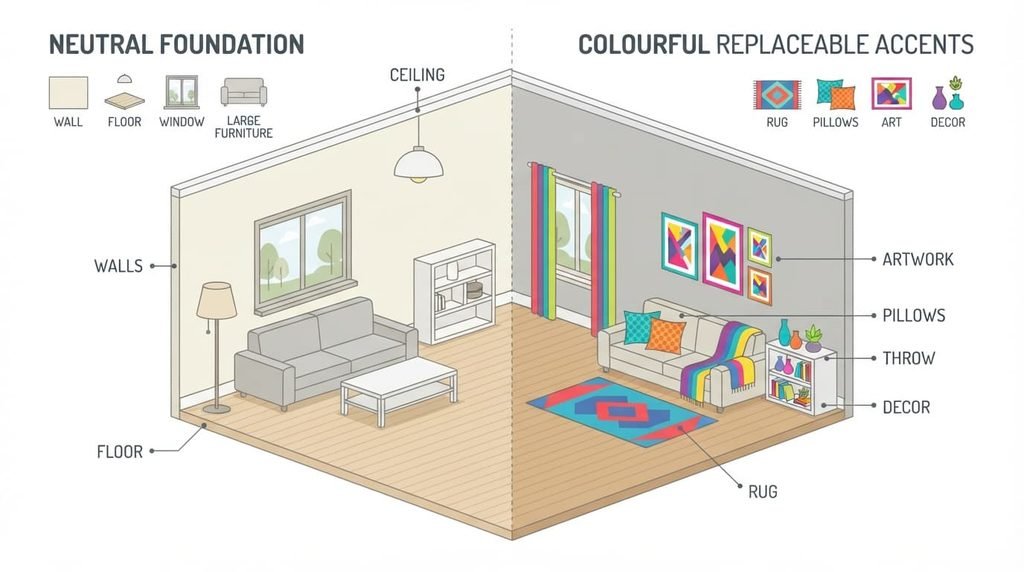
A room built this way still typically includes at least a few genuinely bold, child-chosen elements layered on top – a colourful rug, playful artwork, character-themed bedding – specifically to avoid the sterile, overly adult-feeling outcome that applying the neutral approach too completely and rigidly risks producing.
Where this trend genuinely holds up
The adaptability mechanism behind neutral, nature-inspired palettes doesn’t depend on current taste, which is why it’s a reasonable longer-term choice specifically for a kids’ room’s larger, harder-to-change surfaces – walls, larger furniture pieces. A room genuinely planned to serve a child across many developmental years benefits from this approach regardless of which decade’s aesthetic currently favours the specific muted tones being used.

Where the verdict should stay negative
A fully neutral, nature-inspired palette applied to every single element in the room, including the easily replaceable personality accents, genuinely isn’t worth pursuing, despite how consistently this complete approach gets marketed as a universally superior modern kids’ room aesthetic.
A kids’ room with absolutely no bright colour or bold personality anywhere at all risks feeling genuinely sterile or overly adult-oriented rather than appropriately playful for an actual child’s own space, since the adaptability benefit neutral tones genuinely provide applies specifically to the harder-to-change foundation, not to every single element including where genuine childlike personality and colour are actually appropriate and even developmentally valuable and worthwhile to include.
What people get wrong when adopting it
The most common mistake is applying the neutral, muted approach so completely that the room loses any genuine sense of being a child’s own space, treating “adult-approved aesthetic” as inherently superior to spaces that genuinely reflect a child’s own actual preferences and personality through colour and pattern in the easily replaceable elements.
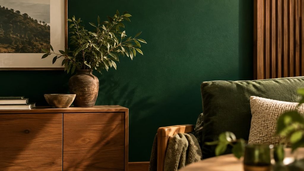
A second genuinely common mistake is assuming “nature-inspired” automatically means muted or dull, when genuinely nature-inspired palettes can actually include richer, more saturated tones too – a deep forest green, a vibrant sky blue – provided they’re genuinely chosen more for their actual grounding in natural inspiration than for the specific narrow “soft neutral” aesthetic often associated with the broader overall trend.
Questions readers keep asking
Does a neutral kids’ room palette mean avoiding bright colours entirely?
Not necessarily – the adaptability principle applies most specifically to the larger, harder-to-change surfaces like walls, while bright, personality-driven colour can still appear meaningfully through easily replaceable elements like bedding, artwork, or smaller accents without undermining the broader foundation’s longevity.
Is this trend just a temporary aesthetic preference that will look dated soon?
The underlying adaptability mechanism it’s connected to doesn’t depend on current taste, suggesting genuine longevity specifically for kids’ rooms planned across multiple developmental years, though specific muted tones chosen within the broader approach can still date in the usual way any decorating choice eventually does.
How do I balance a neutral foundation with my child’s own genuine colour preferences?
Letting your child choose colour and pattern specifically through the easily replaceable elements – their own bedding choice, artwork they’ve selected, a favourite rug – while keeping the larger, harder-to-change surfaces in the more neutral, adaptable palette tends to genuinely satisfy both the longevity principle and your child’s actual current personality and preferences.
Do child development experts genuinely support muted colour environments for kids’ rooms?
Views genuinely vary quite meaningfully among specialists, and existing research on colour and child sensory response isn’t fully settled or universal in any clear way – some children genuinely respond well to muted environments, while others don’t show meaningfully different responses at all, making this a reasonable individual consideration rather than a universally agreed developmental recommendation across the board.