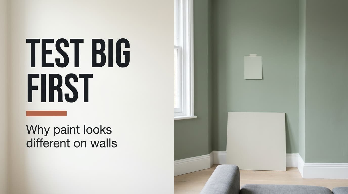
Why do our walls look different from the sample we chose in the shop? The card showed a soft sage, and the room shows something darker and colder. That’s a problem of scale and light, and taste plays no part in it.
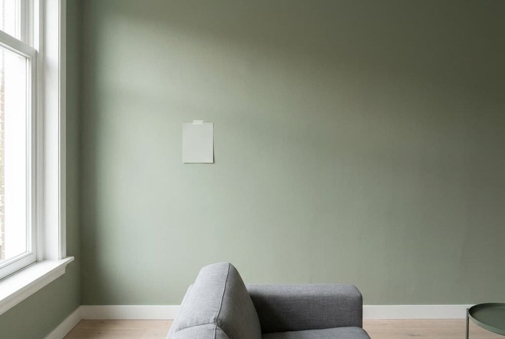
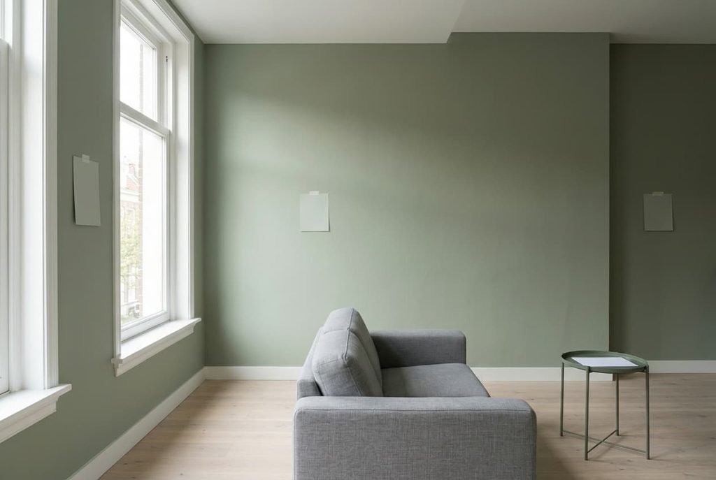
The model room is Dutch, 380 × 460 cm, and 250 cm tall, with a 180 cm window facing north. The card measures 10 × 15 cm and was lit by shop lighting near 4000 K. Every light reading below is an assumed figure, so take your own with a phone meter before you act on any of it.
What is actually happening when our walls look different from the sample
A card shows a colour alone, in your hand, under shop lighting. A wall shows the same pigment at a different size. It also sits under different light and beside different neighbours, so three things change at once.
Size comes first. The card covers 150 cm², and the 380 × 250 cm wall covers 9.5 m², which is 633 times more. A large patch of one colour reads stronger and deeper than a small one, because the eye has nothing nearby to compare it with.
Bounce is second. Each wall lends some of its colour to the others, so light reaches your eye after two or more reflections. In a simplified model, a sage reflecting 60% of green light and 40% of red has a green-to-red ratio of 1.5 on the card. After two bounces the ratio is 1.5², or 2.25, so the room looks visibly greener than the card did.
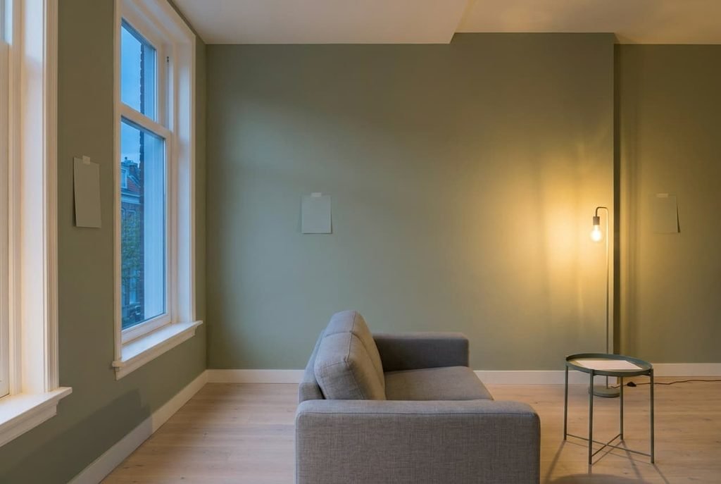
Light is third. North daylight sits near 6500 K, shop lighting often near 4000 K and evening bulbs near 2700 K. People blame the tin, yet the paint is behaving normally and the viewing conditions are what changed.
How to tell which fault makes the paint look different from its sample
Run three looks from the doorway. First, press the card against the wall and move back 3 m. If the wall looks stronger and darker all around the card, scale is the fault. Keep the card at the wall’s mid-height so the light angle matches. Next, look at the wall at 10 a.m. and again at 9 p.m. with every lamp the room normally has switched on, because one ceiling light alone gives a false reading. A shift from cool grey to warm yellow points to colour temperature. Last, compare the wall next to the window against the far corner. A colour that changes along the wall points to placement. Choose one hour and keep to it, since daylight alters a wall’s tone by the minute. Write a single word beside each look, say colder, so your notes do the comparing instead of your memory. Don’t judge by a photo, since a phone corrects its own white balance and hides the very shift you’re hunting.
Usually two of these faults turn up together.
The faults, diagnosed
“The wall is darker and stronger than the card” comes from scale and bounce, the usual reason walls look different from the sample. At 633 times the area, and with a second bounce lifting the 1.5 ratio to 2.25, the wall wins. Start free by holding the biggest piece of the colour you can find, perhaps an offcut, against the wall at eye level. Then buy a sample pot and paint two boards, each 60 cm square, which is 3,600 cm² and 24 times the card. Tape them on two different walls for two days. That costs one pot, and two boards can’t show the bounce of four painted walls, so expect a slightly stronger result.
“It’s grey in the morning and yellow at night” comes from the light and not the pigment. North daylight near 6500 K is 3,800 K cooler than a warm bulb at 2700 K, so the same surface returns a bluer spectrum by day and a warmer one by night. Start free: judge the colour only under the light you’ll use the room in. Next, rearrange by carrying a board to the wall that gets the least daylight at dusk. Then buy bulbs and fit 2700 K in every fitting, because a room lit by two bulb types splits the colour in two. That costs a handful of bulbs and a few minutes.
“It looks right by the window and wrong in the corner” comes from placement. Assume 450 lux beside the window and 90 lux at the far wall, a ratio of 5 to 1. With paint that has a light reflectance value of 40, meaning it returns 40% of the light that hits it, the near wall sends 57 cd/m² to your eye and the far wall 11. Candela per square metre measures luminance, the light a surface sends towards you. The eye adapts, though the far wall still reads duller. Start free: put a board on every wall and choose by the darkest one. Next, move a lamp you own already onto the far wall. Then buy a wall lamp of 400 lm at 150 cm, which lifts that wall to about 180 lux in our model, which is 2 to 1. The lamp is the only outlay.
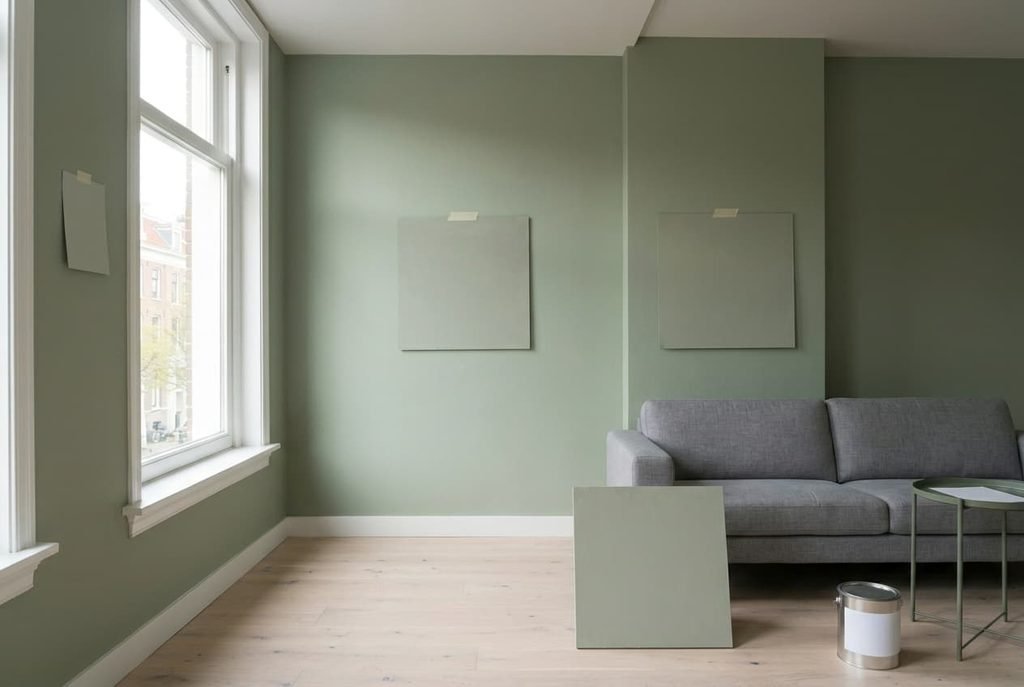
What to check before you add anything else
Before the next colour can make the room look different from the sample, put it through four checks. Paint two boards, each 60 cm square. Tape them to different walls. Look at each at 10 a.m. and again at 9 p.m. with the lamps on, which makes 4 looks per board over two days, or 8 for the pair. Wait a full day for the paint to dry, since a damp coat sits at a different tone. Last, hold the dry board next to the floorboards and the sofa. A colour that agrees with its neighbours at 1 m often disagrees at 3 m, so step back. Decide on the board that looks worst, because that’s the wall you’ll notice in a year.
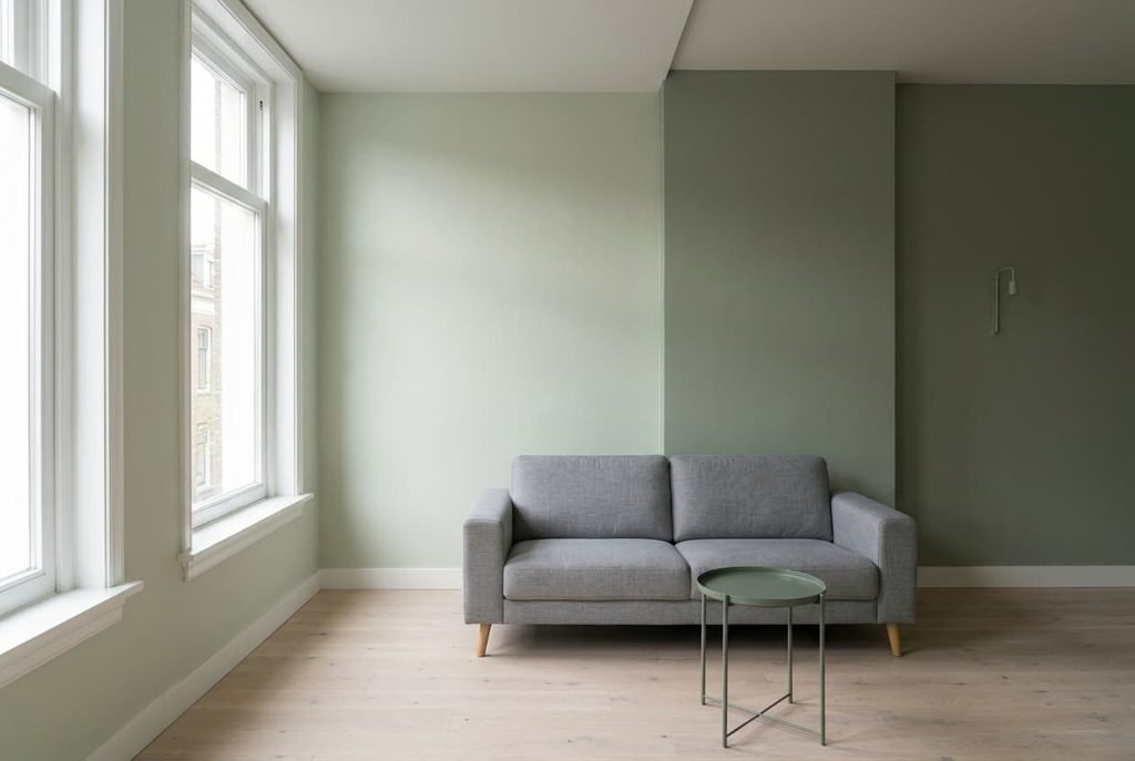
The fix that isn’t worth doing
Going one shade lighter than the card is the rule most guides repeat, because large areas look deeper. It fixes scale and breaks placement. Asking the shop to remix at half strength runs into the same problem, because it lightens every wall by one factor and the difference between the walls survives. Take paint with a reflectance of 40 and a step lighter at 50. Near the window, luminance rises from 57 to 72 cd/m², a gain of 25% on a wall that needed no help. The far wall rises from 11 to 14 cd/m² and stays at one fifth of the near wall. The gap between the walls holds at 5 to 1, so the corner stays dull while the window wall turns chalky.
Light the far wall instead.
A card and a wall differ in size and in light, and the wall has neighbours the card lacks. Those changes explain nearly every case where our walls look different from the sample. Run the three looks from the doorway, then paint two large boards and live with them for two days before you commit. Fix the light first, because a bulb is cheaper than a second coat, and repaint only when a board shows the wrong colour. Keep the boards after you’ve decided, because they’re the record of what the room did to the colour. Working in that sequence is cheap and instructive.
Questions readers keep asking
Why does the same paint look darker on the wall than on the card?
The wall is hundreds of times larger and bounces light between its neighbours. In our model it covers 633 times the card’s area, and a second bounce raises a colour ratio of 1.5 to 2.25. Large areas of one colour read deeper, so test on a 60 cm square board instead of the card.
What’s the quickest way to test a colour before buying?
Paint two 60 cm square boards, tape them to different walls and look at each at 10 a.m. and again at 9 p.m. with the lamps on. Wait a day for drying first. That gives eight looks in two days, and the only purchase is one sample pot.
Can I fix a colour I dislike without repainting?
Often, yes. Fit the same 2700 K bulb in every fitting, move a lamp to the dullest wall and check the result after dark. These steps address light and placement, which cause most of the shift. Repaint only if a large board still shows the wrong colour.