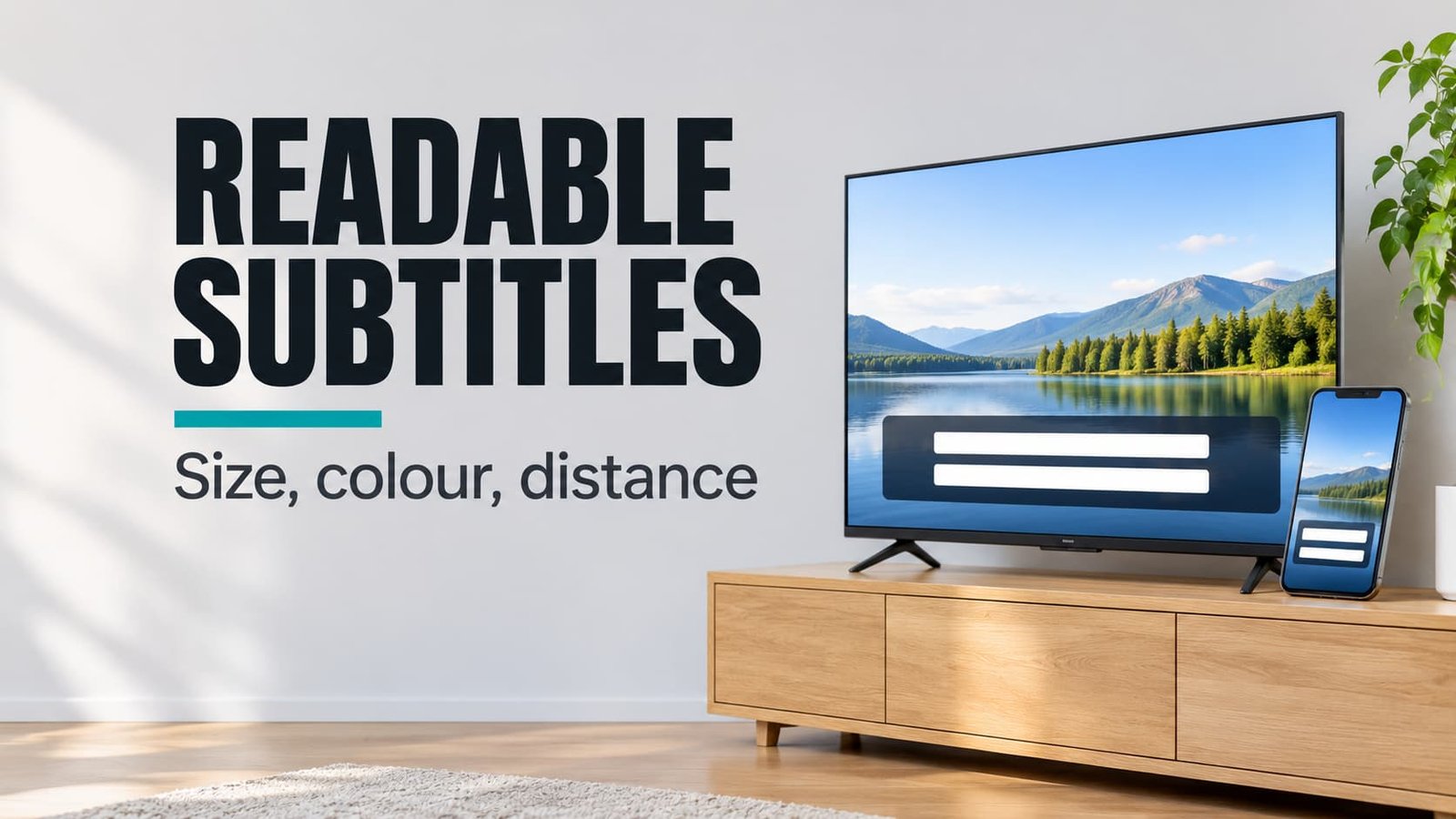
When you finish, the subtitles on your television and your phone will read at a glance from the seat you really use. Plan on about 20 minutes. The route forks once: your television either shows a live sample while you change the style, or it makes you judge on a real scene. Readable subtitles on a TV come down to one ratio, text height divided by viewing distance, and the phone needs the same ratio from a shorter range. The worked example is Priya, who sits 3 m from a 55-inch screen in a Leeds flat and holds her phone 35 cm away in bed.
Before You Start: Readable Subtitles on a TV Need One Measurement
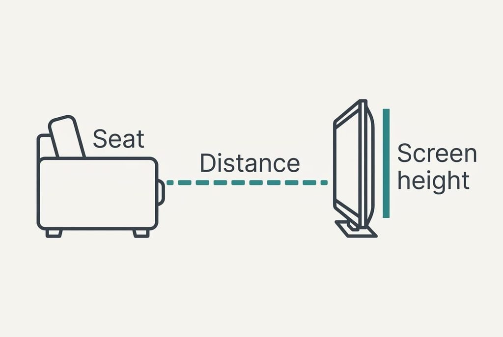
Most people skip the measuring and drag a size slider until the sample looks fine in one afternoon’s light, which is why you should measure the distance from your usual seat to the screen first. Priya’s seat sits 300 cm from the glass.
Her screen is 55 inches, which is about 140 cm on the diagonal. A 16:9 picture of that size stands 68.5 cm tall. Take 5% of that height for one line of text and you get 3.4 cm. Divide by the 300 cm distance and the ratio is 0.0114. Every later step aims at that number. It’s a working target rather than a standard.
You also need a ruler and one scene with a bright background, for example a snowfield. Bright frames are where weak subtitles fail first. Keep the remote close, because you’ll flip between the settings screen and the picture.
Note three figures on paper.
They are 300 cm, 68.5 cm and 3.4 cm. You’ll use them in steps 2 and 5, and the note saves you redoing the sum whenever a menu interrupts you.
Six Steps for Subtitles on a TV and a Phone
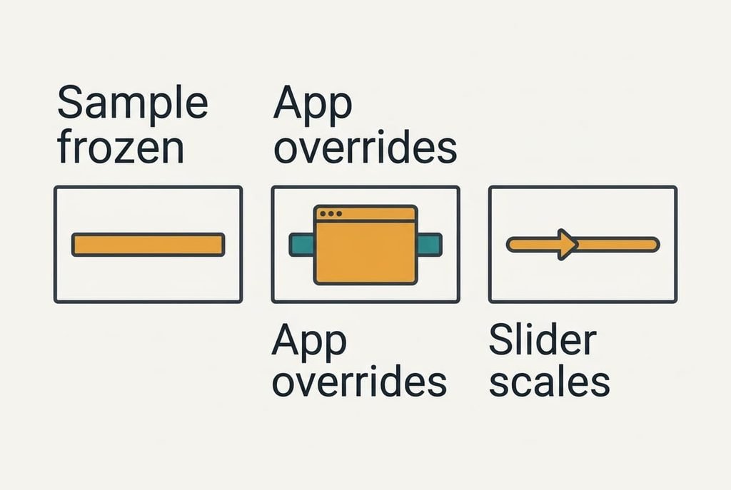
1. Find the group of settings that controls how captions look, usually named after captions. Look for a sample line that changes as you adjust. A live sample means you can judge on the spot, whereas a frozen one sends you to a real scene. Some sets keep separate styles for built-in channels and for apps. Repeat the check in both places.
2. Raise the size until each line stands 3.4 cm tall on the screen, and hold the ruler against the glass to check. Presets rarely quote a measurement. Choose the one nearest 3.4 cm. A measured height beats a label such as medium or large. Say Priya’s presets measure 2.8 cm and 3.6 cm: she takes 3.6 cm, a little above target, because larger text costs less than squinting.
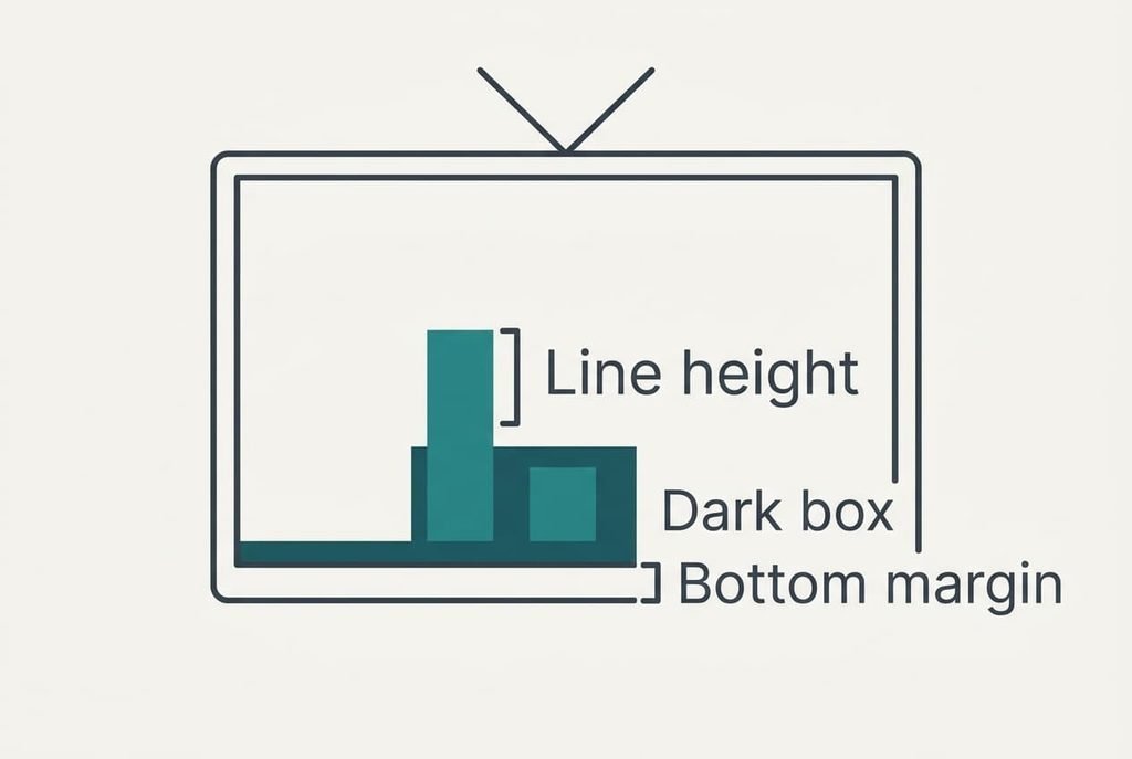
3. Set the text to white or pale yellow on a dark box at about 75% opacity. Over a white scene that box leaves a grey near 25% brightness, which gives a contrast of roughly 10 to 1. White on an opaque black box would give 21 to 1, and the 75% box trades some of that for a view of the picture behind. Play your bright scene to confirm the letters stay sharp.
4. Add a thin outline or soft shadow only when the box is off, since the two together blur small letters. A soft shadow works on a plain background but fades on bright frames, which is why the box is the first choice. Check the letter edges near the corners, then at the centre.
5. Keep the bottom margin at 3.4 cm or more. The lower line then clears the strip that some older sets crop at the screen edge. Priya’s margin leaves 5% of the picture height clear under the lower line. If a line still sits right on the picture edge, lift the position setting a notch rather than shrinking the text. Watch ten seconds of dialogue and confirm no line loses its final letters.
6. Open the phone’s own caption style and apply the same ratio: 35 cm times 0.0114 gives 0.4 cm per line. Resetting a style wipes any custom colours you’ve saved. Photograph the values before you reset anything. Hold a ruler on the phone as you did on the television, because size labels vary between phone models. Then check two different apps.
A Test for the Finished Setup
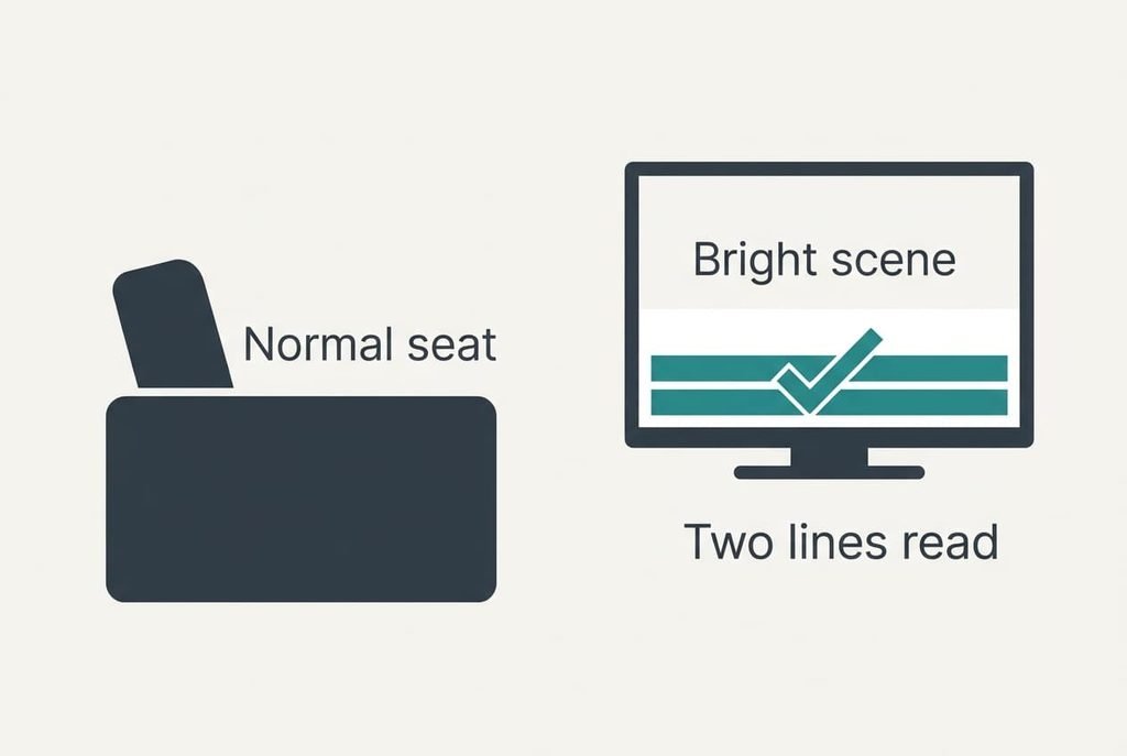
Pause on the brightest scene you own, then take your normal seat and read both lines without leaning forward. Priya needs about three seconds for a 42-character line, because typical subtitle reading runs near 15 characters a second. A pass means you finish both lines before the next caption replaces them.
Repeat on the phone at 35 cm, again on a bright frame. When either device fails, change one setting only, then look again. Changing three at once hides which change helped.
Finally, run five minutes of normal viewing with the lights as you usually have them. A setup that passes a still frame can still fail when the picture moves, and five minutes of dialogue shows it. Readable subtitles on a TV should need no effort, and any urge to squint means the size is still short.
Where the Settings Stall
Three things catch most people. The first is a sample that never changes, because the television draws it only inside its own menus while an app uses its own engine.
Judge on a real scene in that case.
The second is a streaming app that applies its own caption style and ignores the system one. Test readable subtitles on a TV in two different apps and note which follow the system. Any that ignore it need their own setting, at about thirty seconds each.
The third is the phone’s text-size slider. It also scales captions. A style that looked right yesterday can double after you raise the slider for the whole screen. Recheck the 0.4 cm height after any change to that slider. Do the phone check with the brightness at the level you normally use, because turning it up can mask a weak box.
The Step Not Worth Taking
Skip trying out typefaces in every app, because the ratio and the box do almost all of the work. A decorative face costs reading speed for nothing, and a plain sans-serif is enough.
The sums show why the effort is wasted. Six typefaces across four apps at two minutes each is 48 minutes, against five minutes with the ruler. Some apps also reset a font choice after an update, and the 48 minutes then vanish. Spend that time on the check that matters instead, which is reading a bright frame from your seat.
The same logic covers a separate profile for each film type. Once the box is set, readable subtitles on a TV hold across dark dramas and bright quiz shows alike. Extra profiles add menus without adding clarity. One profile, set once, covers the household whenever everyone sits at a similar distance.
You’ll finish with two numbers: 3.4 cm on the television and 0.4 cm on the phone. Priya’s subtitles now read at a glance from the sofa and in bed. The only recurring chore is to recheck the ratio whenever the screen or the seat changes. A new television at another size changes the target. So does a sofa moved 50 cm closer, and the arithmetic takes a minute with the same ruler. Pick an evening when nothing else on your list needs the television.
Questions Readers Keep Asking
How long does this take?
The television takes about 15 minutes and the phone 5, with most of that time on the ruler step and one bright scene. Presets save a few minutes. A second screen in the house adds another 10 for the same measuring routine.
Will changing the style erase anything?
Changing the style loses nothing from your viewing history or apps. A full reset to defaults does wipe any custom colours and sizes you’ve saved. Note the values first. The two numbers in this guide rebuild the whole setup in a minute.
What if I mostly watch on a laptop?
The same ratio applies. Measure from your face to the screen, multiply by 0.0114, and set the player’s caption size to match. A laptop at 60 cm needs about 0.7 cm per line, which is a fifth of the television’s height.